

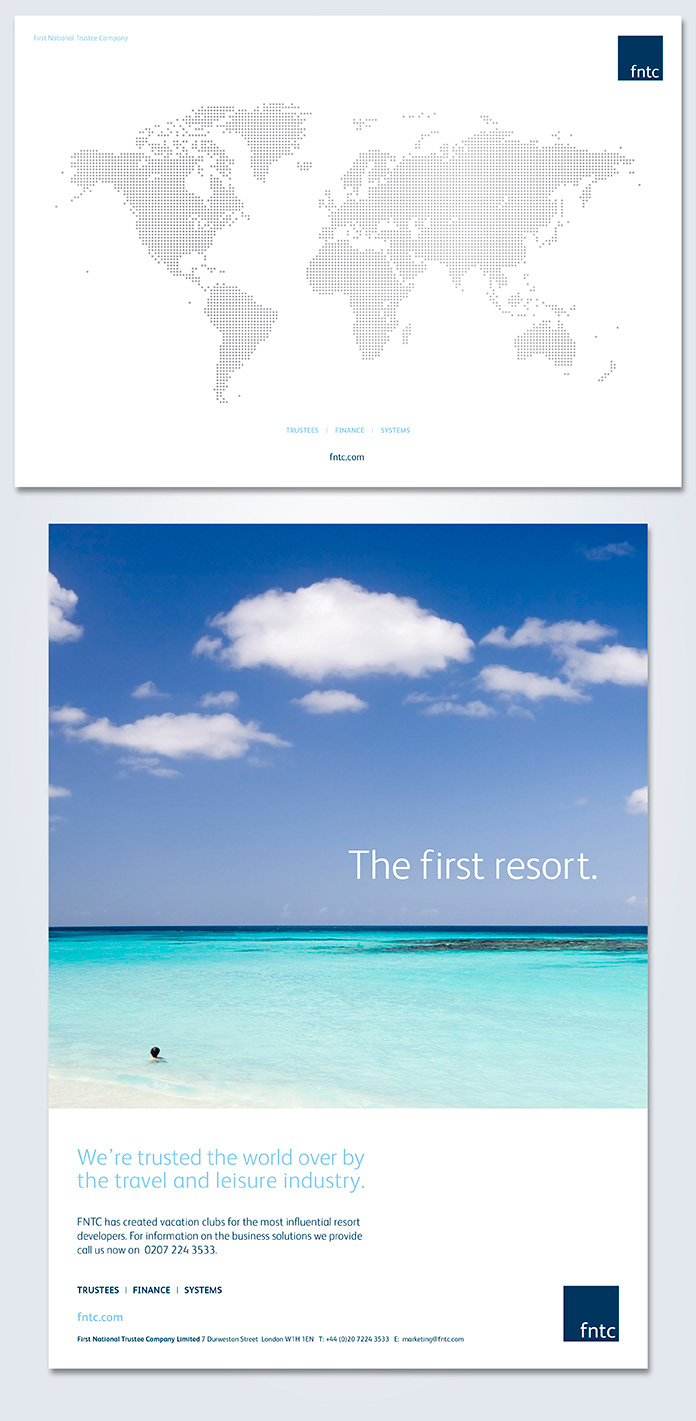

First National Trustee Company (FNTC) are the world’s leading trustee company. They manage over £2.5bn worth of property assets and work with over 300 resort and leisure real-estate developments. In addition they provide services to over 650,000 consumers worldwide.
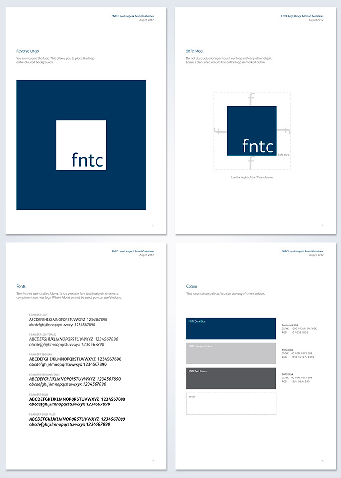
After a competitive pitch I was appointed to rebrand FNTC, starting with their logo. Their previous logo had become out of date. It was too complex, confusing and out-of-touch. It was disliked by staff and needed to be brought in-line with the market and modernised.
The previous brand colour was a dark red which didn’t really suit their industry, so a deep blue was chosen along with a modern sans serif font which would replace the previous font. Supporting colours of grey and light blue were also introduced to compliment the new colour.
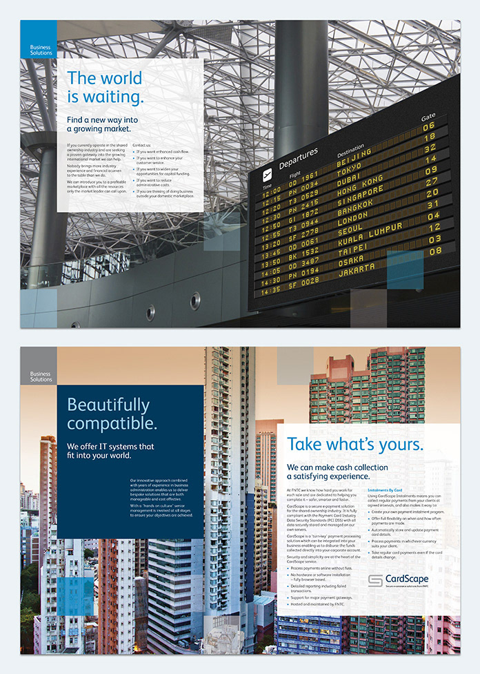
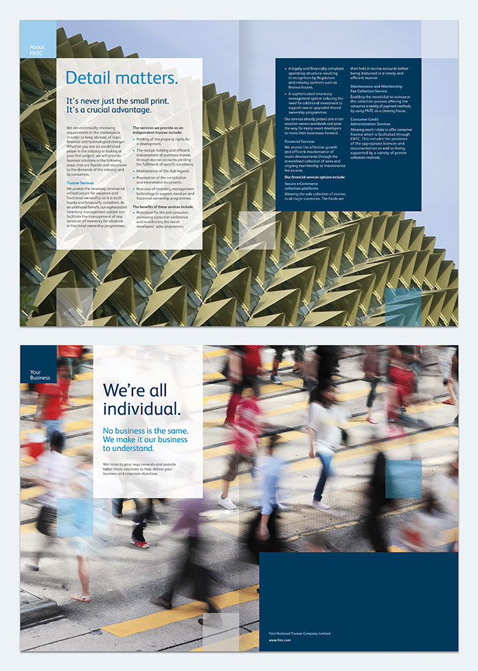
The rebrand consisted of redesigning all printed communications which included company stationery. Additionally APAC and international corporate brochures and inserts and devising a new advertising campaign. The square shape of the logo was incorporated into a grid design and used throughout the new collateral, overlaid with abstract building and international themed photography.